


Project Context
SEDS is the São Paulo State Social Development Department, responsible for programmes and policies across government, including food security, income support, and protection for vulnerable groups. With about 46 million residents, the state serves a population larger than Canada, so communication must make these services easy to understand and use.
Within the communication department, social media was used mainly to replicate formal announcements from other channels. There was no clear strategy for how social platforms should support the programmes, and posts carried over long texts without formatting or engaging visuals.
As the lead designer, working closely with the head of marketing and communication, I supported a new strategy and created a new visual language. We positioned social media as a complementary channel to traditional communications, using clearer structures and more approachable visuals to reach a broader audience.
Designing for Social Impact
We first defined a schedule that mapped SEDS’s priority initiatives over time. Food security, income transfer, refugee support, human rights, and protection services, among others, were organized into clear, recurring themes to guide the social media presence.
We introduced a more expressive visual style to stand out in the feed: bold typography, colour, textures, illustration, and motion. Static images and short animated GIFs were designed to catch attention first, while concise post copy focused on the essential information people needed for each service or campaign.
Creating posts ahead of time, aligned with the schedule, kept production flowing without interruption and maintained a consistent voice across topics. The new system translated into themed post series like these:


Campaign posts that explain how to donate a portion of income tax to social causes.


Content focused on welcoming refugees into the social protection network.


Friendly posts for older adults, reinforcing care, protection, and digital inclusion.

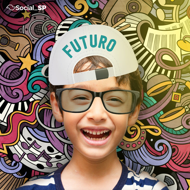
Youth-oriented series connecting social programmes and future opportunities.


Posts focused on food security actions, highlighting affordable, quality meals.
Making Social Content Work
With a clear strategy, social media moved from copying announcements to actively supporting key initiatives. Communication teams gained a clearer view of which themes to prioritize and how to present them in the feed. Together, this work helped the department speak more clearly to people who rely on these services and aligned social content with the broader communication strategy.