
After deep dive into research, having designed the new Six Factor website, with a solid foundation, it was time to focus on Proximity, the Six Factor tailor-made geo-map layering tool. Proximity offers to businesses, critical information in the right place, at the right time.
Working closely with the Director of Business Innovation, who developed the marketing strategy and provided content, I was in charge of creating the product brand, mockups screens, and an efficient also visually appealing landing page.
The Brand is part of a Six Factor products suite, which involves several other projects. For this specific logo, one of the requirements was to use red as a base color (one of the Six Factor logo colors). Not only for its power and energy but as part of the company's marketing strategy.
In few words, the logo shape evokes a pin map that is strongly related to a digital map product, at the same time the initial of Proximity. Inside the shape, I used 2 different red tones following the rounded pin shape to express movement, the live aspect of the tool.
The Proximity font is Merryweather Sans, a modern sans-serif font designed especially for screens. Six Factor is the western's Canada leading Google Cloud Partner, also Merryweather is available at Google fonts, which means all team members have easy access to the font when creating documents using Google software.
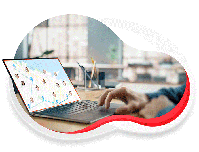
As part of the several cloud shape designs that express Six Factor, the Proximity hero image belongs to the same family. The purpose was to create an engaging design to call the viewer's attention. The loop animation also represents the different layers Proximity provides to its clients.
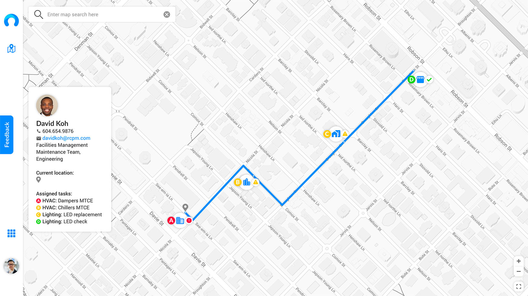
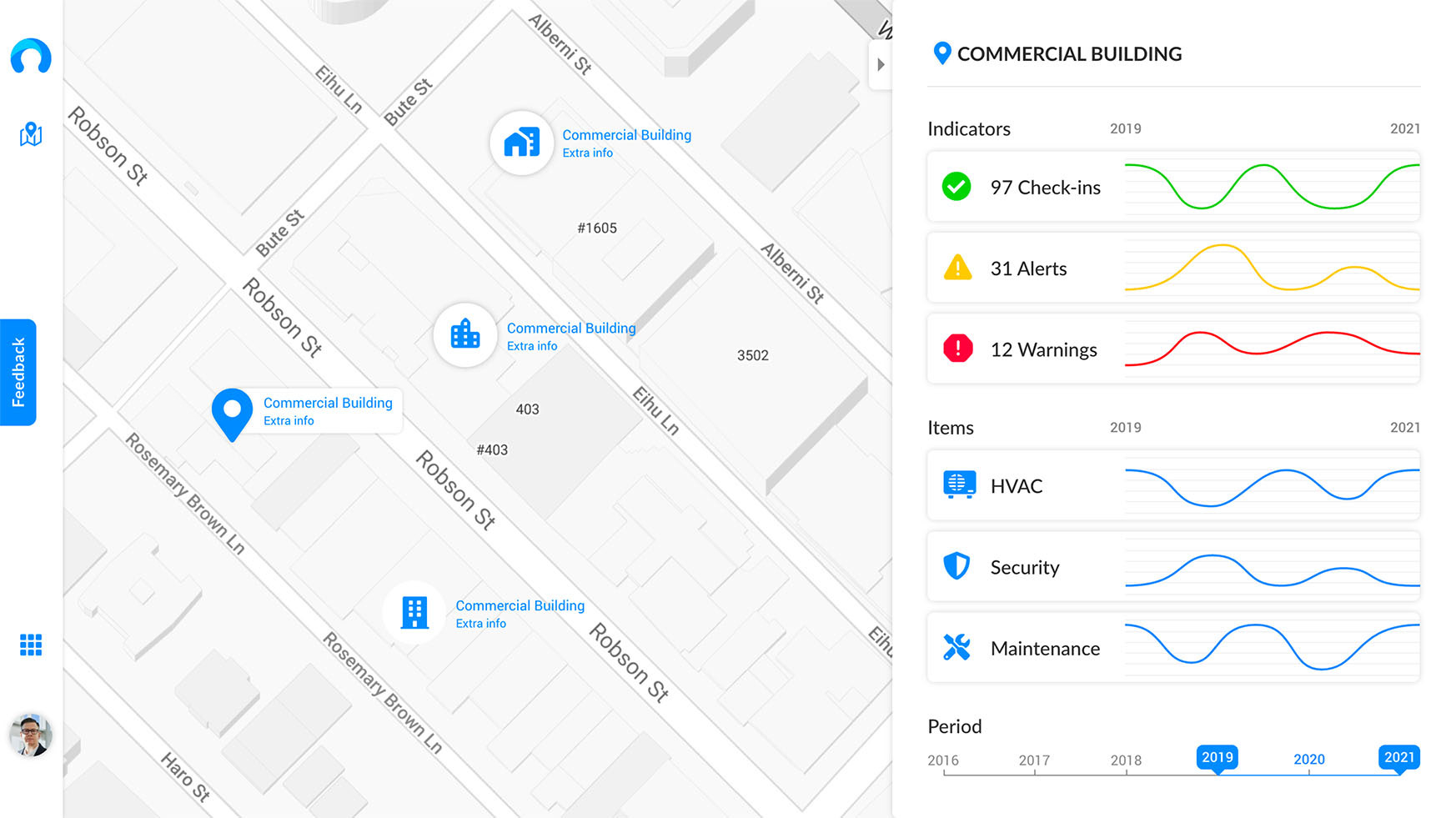
The product mockups display a glimpse of all the features Proximity can deliver for all kinds of businesses. Since trends over time, integrated to map system, to smart routes for business maintenance services.
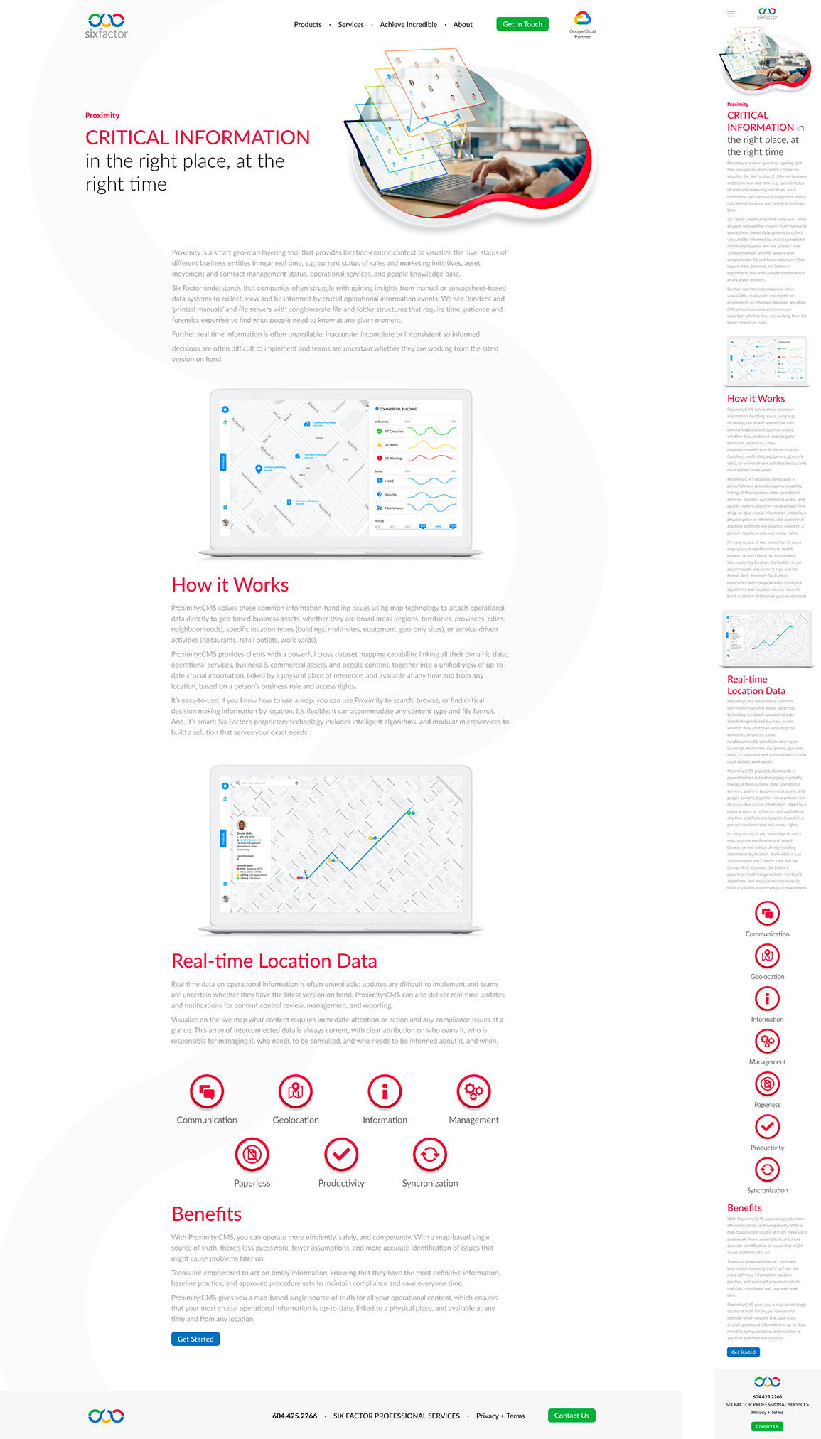
All the foundation developed for the Six Factor website is implemented here to deliver a clean, modern, and engaging landing page. Combining the hero image animation, the Proximity mockups, the product benefit icons, and a fluid light gray curve at the background, the design achieves its purpose to reach clients, provide information about the product, and concluding with a call to action to prospect new business opportunities.