


Project Context
HumanizaSES is the São Paulo State Health Department’s policy and network for humanized care in the public health system. The State of São Paulo in Brazil, with about 46 million residents, serves a population larger than Canada, so clarity and trust in government communication are critical.
Within this scale, the programme builds a culture of humanized care by shaping how staff welcome, listen to, and guide people through the system. Each positive interaction strengthens the reputation of the health service and shows that government can act with care, respect, and accountability.
As the lead designer, I was responsible for creating the HumanizaSES identity and visual system that carries the policy across the public health network, turning humanized care into a visible government commitment for people across the state.
Designing for Humanized Care
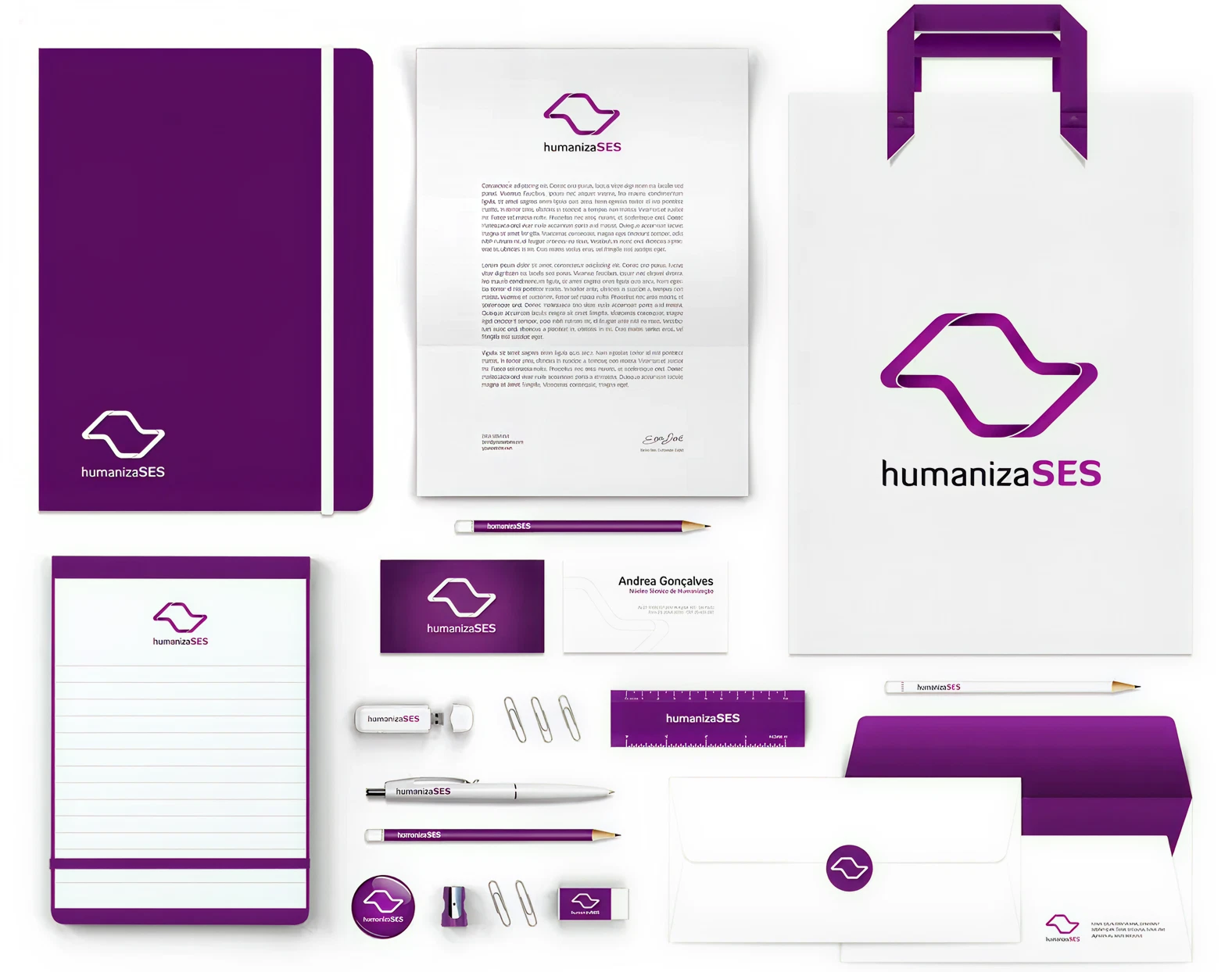
The HumanizaSES identity begins with a familiar reference: the silhouette of São Paulo state and the popular sidewalk pattern found in many public spaces. Grounding the mark in these forms keeps a direct link to the state and creates an immediate, emotional connection with people who identify the shapes as part of their everyday environment.

From there, I reworked the hard, angular outline into a set of rounded, interconnected elements. The softer corners, overlaps, and sense of movement reflect a shift from rigid bureaucracy to ongoing relationships, suggesting connection, integration, and continuity across services. The final symbol is simple and recognizable, but it also represents the network of teams and bonds that make humanized care possible.

The clear system keeps the message official, approachable, and easy to identify. Everyday items turn the policy’s commitment to humanized care into something government teams and frontline staff can proudly use in their day-to-day work.
On uniforms, the symbol becomes part of how staff present themselves, signalling that the people patients meet are connected to the humanized care initiative.

Visibility and Impact
The HumanizaSES identity gave the policy a single, recognizable presence across the state network. It helped teams present humanized care as a coordinated government initiative.
Working inside a large public organization, the system had to satisfy different perspectives and backgrounds, from technical teams to directors and communication leads. I led the design through these approvals, balancing institutional expectations with a more human, approachable expression.
With a clear identity and visual system in place, the health department can support culture change from within the system and make humanized care visible across the state’s public health network.